-

-
Chapter 3:
Lost in the Adventure
-
Of course, there are plenty of other reasons to play video games besides challenge: relaxation, ambience, atmospheric immersion, role-playing, intellectual stimulation, sense of adventure, a good story, beautiful things to see. For mappers, their Doom creations can be an outlet for artistic expression, and conversely, for players it can be a way of appreciating what other people have to say. Doom is an art scene.
Level design that revolves around establishing mise en scene or the feeling of going on a grand adventure, with combat that primarily exists to keep the map moving rather than occupy much of the player’s attention, is seemingly the polar opposite of the Plutonia ideal, where the architecture exists solely to serve the flow of combat and anything that lowers the adrenaline or slows the map down is a detriment. Likewise, puzzle elements add to the sense of delving deeply into the game world, but would grind any Plutonia-style map to a screeching halt. For this reason, discussions about Doom mapping are very often framed as a dichotomy where combat stands opposed by literally every other aspect of design. A challenge mapper might say that letting any other element come first detracts from the quality of the combat, while an adventure mapper might point out that combat that is too fast or challenging detracts from the player’s ability to appreciate everything else that goes into the level design.
For mappers, their Doom creations can be an outlet for artistic expression, and for players, they can be a way of appreciating what other people have to say
Both halves of this debate are largely a product of the 2000s and 2010s, and I don’t mean to suggest that adventure mappers in the 1990s were reacting against challenge maps or vice versa; I’ve personally seen no evidence for this. But you can see the beginnings of the split quite early on as the different schools of design began to form—it’s a natural divide that occurs among players (and mappers) in many gaming communities.
Some of the earliest hints of adventure mapping can be found in Invasion 2: The Upper Decks and Galaxia, which use a realistic approach to architectural layouts to establish a sense of place and environmental details to tell a story as you progress through the map. TeamTNT’s first two megawads, Evilution and Icarus, also frequently use a more environmental approach to level design in order to immerse the player. But it was another TNT megawad that really set the first gold standard for adventure mapping.
-
 Eternal Doom - Team Eternal / TeamTNT (1997)
The Odyssey
Eternal Doom is the epitome of everything Plutonia isn’t. The megawad places an enormous emphasis on what was possible to achieve with Doom-engine aesthetics at the time, but it’s not just about making a given area look attractive; much more than that, Eternal Doom is about creating a sense of place, a feeling that the world you’re infiltrating is intricate, fully detailed, and alive. The combat, rather than being the primary focus, fills in around these details and serves as a supplement. The idea is that killing monsters is fun in its own right and doesn’t need to be a focused activity; instead, it should take a back seat and allow you to partake in the adventure.
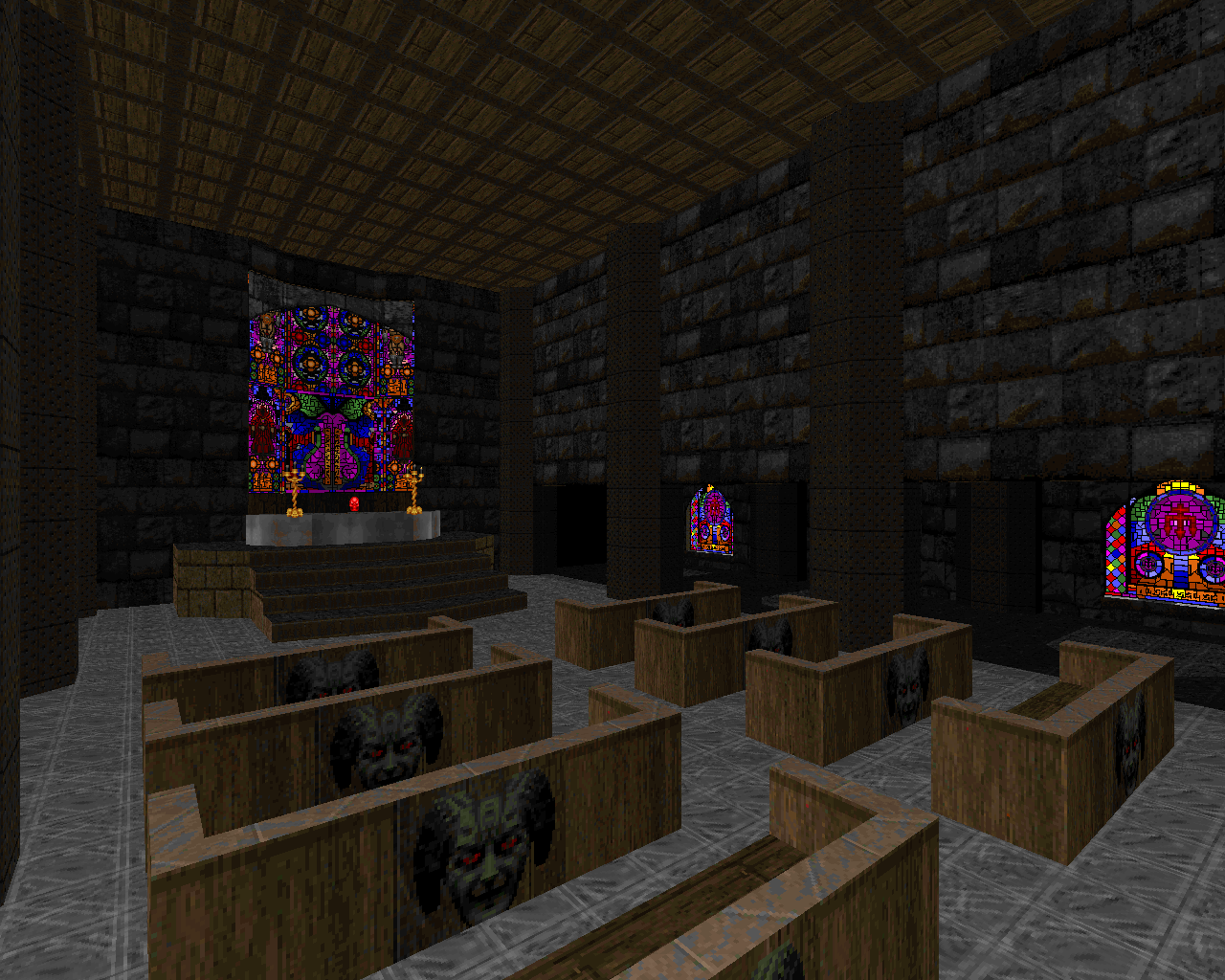
As a result, Eternal Doom doesn’t deal in abstraction the way Plutonia and even the original Doom games do—abstraction would be antithetical to conveying the sense of place. Instead, most maps in the megawad (and certainly all of the really memorable and beloved ones) take great care to infuse each scene with details that establish the location and increase the level of immersion in the setting. Techbase settings such as “Genesis” (map 01) feature looming computer consoles that control nearby objects, plausible reactor-like structures, cryosleep chambers, and other mechanical structures that imply a concrete purpose. The warehouse grounds of “Nucleus” (map 04) contain huge crate mazes that recall E2M2 of Doom (which itself could likely be called the first adventure map), along with a sewer system and a perimeter waste tunnel for toxic runoff. In the fantasy “otherworld” maps, fortress architecture is designed to feel functional and lived-in as well as designed for aesthetic beauty. Towers feature crenellations not because it makes the gameplay smooth (perhaps the opposite, in fact), but because fortified towers should realistically have crenellations, and it wouldn’t feel like a castle if they didn’t; Chaingunners perch at the top of these towers and snipe at you not because it fits into free-flowing combat design, but because it’s an advantageous position and real enemies would be foolish not to take advantage of it. Cathedrals are designed with arrays of pews, and banquet halls with tables and benches, not because they serve as deliberate routing obstacles for combat but because they are realistic details that flesh out the intended purpose of each room. The way settings are built conveys the idea that the world would exist with or without your presence—that you have merely found yourself as an unwilling intruder, far from home and out of your league—rather than being designed around your survival needs or convenience.
Eternal Doom's world would exist with or without you – you are an unwilling intruder, far from home and out of your league
Similarly, decorations are used as scenery, with an eye for where things should realistically be placed. Standing torches exist where they are realistically useful, and trees are placed in a way that makes them appear to be growing naturally, with no particular order. If these obstacles get in your way, then too bad; real trees would do the same thing, if you were fighting your way through a real castle courtyard, and you should probably have paid more attention to where you were going if you didn’t want to get hit by that fireball. Again, this flies in the face of the way that objects are used in combat-oriented mapsets, which place great importance on pure freedom of movement.
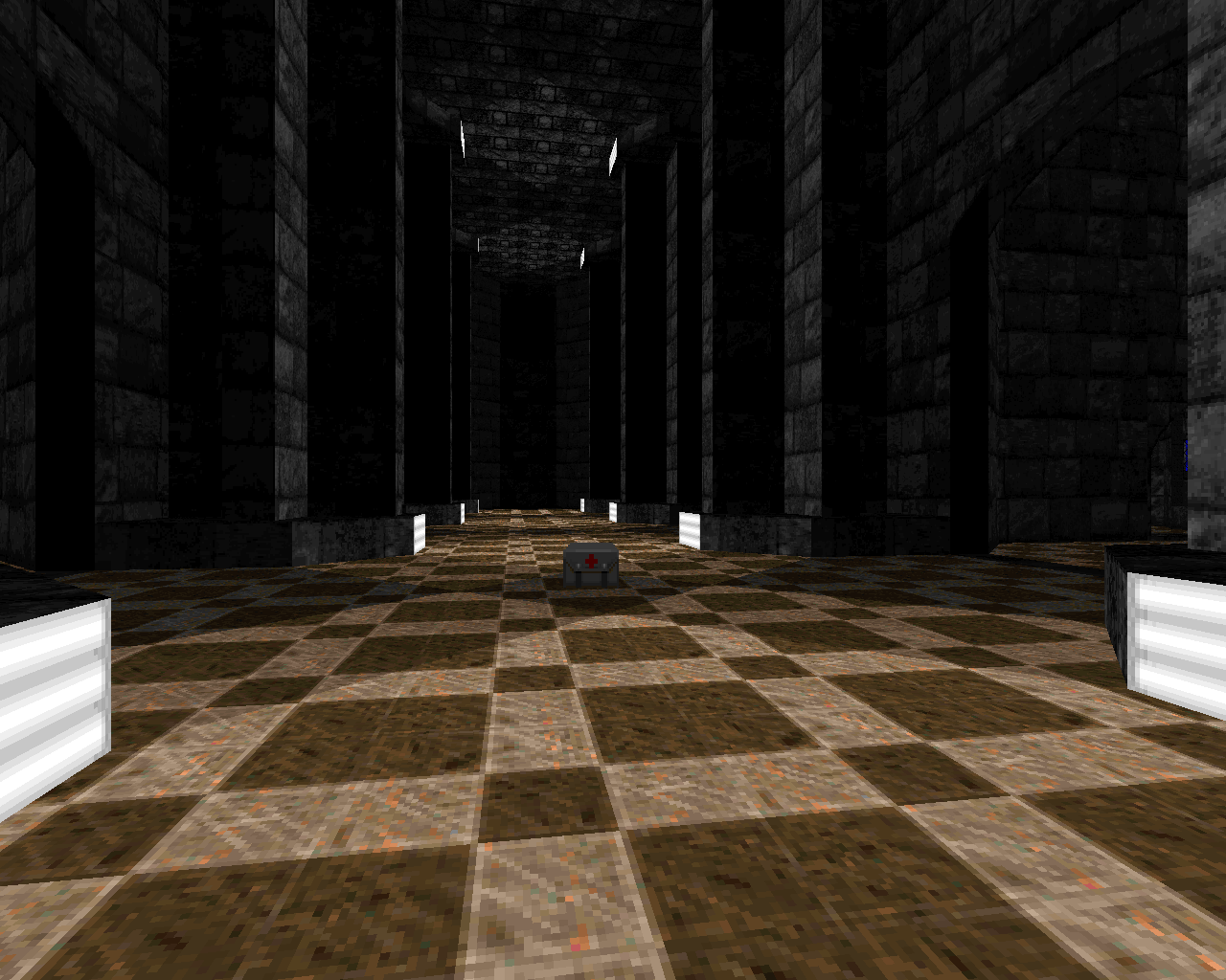
Eternal Doom contains a great deal of custom texture work to help establish its settings, and it was perhaps the first mapset to use midtextures extensively as an aid for storytelling and scene-setting. Vines and spiderwebs (the latter inspired by and ripped from Heretic) drape forgotten corners, creating an overgrown, derelict look. Doorways use midtexture overhangs to create the appearance of curved arches. Fuzz-effect forcefields block openings, and sheets of glass, intact or shattered, create passable or impassable windows. Among the most distinct and ubiquitous midtexture details in Eternal Doom are the flames, both smaller ones licking up from around the edges of lava pits and larger walls of blazing fire, which are used to create memorable details like the huge torches at the beginning of “Darkdome” (map 12) and the enormous tower of flame in “Fire and Stone” (map 21).
Eternal Doom's progression is divisive, with practically every step hard-won through hunting and puzzle-solving - most players will need to set aside hours
Eternal Doom was also one of the first mapsets to use lighting with greater complexity and atmospheric depth than is present in the stylized high-contrast style of Doom and Doom 2. Though the megawad was still bound by vanilla limits and uses relatively few gradients, its maps tend to have a strong focus on realistic light and shadow casting, using blocking structures to build complex shapes out of shadows, and windows or ceiling openings to cast complex shapes of light from outside of the playable space. Sverre Kvernmo’s maps—such as “Time Gate” (map 05) and “Darkdome,” which are widely considered to be among the best in the megawad—frequently give the most attention to lighting and feature intricate “structures” of light that dramatically increase the sense of detail and atmosphere in a room. Entirely dim and dark spaces are often used for fantasy interiors to create the appearance of structures that have been lost to time, and enclosed passages fade slowly into darkness or light with the use of torches; techbases, on the other hand, rely much more frequently on the bright-dark lighting style of the original Doom. This duality helps to create the sense of moving back and forth between two different worlds.
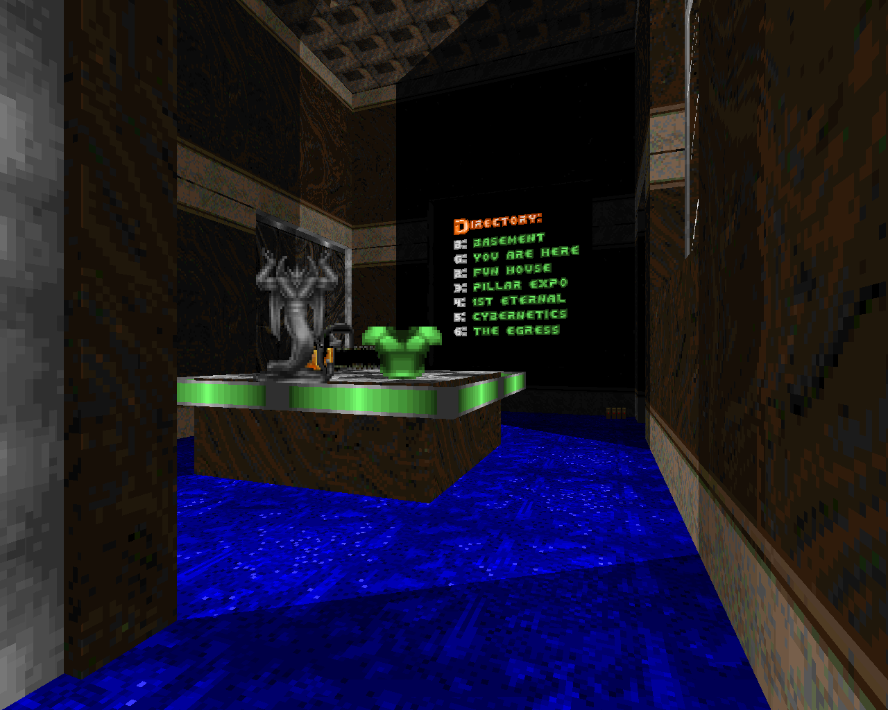
It probably goes without saying at this point that many combat-focused players cry foul on many aspects of Eternal Doom’s level design, but the thing that’s really divisive about the megawad is its puzzles, which usually take the form of obscured progressions. This style of play has its roots in the “adventure” genre of point-and-click games like King’s Quest, where careful exploration is the primary focus of gameplay and solutions frequently require players to think deeply about what they’re looking at rather than simply reacting to the expectations created by game mechanics. In Eternal Doom, mandatory progression is frequently gated behind the types of observational details that would normally be reserved for secrets—cleverly hidden switches, texture changes, and other visual elements that require the player to identify that something is slightly off. As a result, hunting around and observing your surroundings carefully becomes a key part of the gameplay, which is one reason that combat is deemphasized. One of the most famous examples of the megawad’s puzzle progression is in “Silures” (map 20), where you have to identify and “use” the lone dead tree in a grove of living ones in order to open a passage. “Excalibur” (map 30) is the epitome of everything that’s divisive about the progressions, an enormous map where practically every step is hard-won through hunting and puzzle-solving and most players will need to set aside hours to beat it without the Doom Wiki’s walkthrough.
Eternal Doom is about the journey, rather than the destination
There’s a lot going on in Eternal Doom, and if it seems hard to pin down what an adventure map really is, that’s because a true sense of adventure can only be created by combining a great many seemingly disparate elements. Eternal Doom’s slower pace of gameplay helps to build the sense of adventure by giving it a cautious, deliberate feel and playing up all of the visual elements that are important to the player’s sense of exploring and uncovering forgotten lore. The puzzles build a sense of adventure by making you feel like Indiana Jones, unraveling the secrets of forbidden realms in order to find the rewards that they hide. Even the huge size of most of the maps builds a sense of adventure by making the worlds themselves seem vast, and by making you feel like you have to work hard and commit a huge amount of mental energy in order to win. An adventure map can’t be a one-trick pony; you have to feel like you’re really there, and that means you have to be fully immersed in the complexity of the setting, the progression, and the varied mechanics of play. All of these elements come together to create the overarching sense of the mapset as “an experience” rather than simply a fun diversion. Eternal Doom is about the journey, rather than the destination, and that’s why it demands that you take your time getting there and pay attention to everything along the way.
-
 Grove - B.P.R.D. (2004)
Once More, With More Puzzles
It’s one thing to create a project like Eternal Doom, which is essentially a Doom game with elements of other genres thrown in. But to cut a completely un-Doomlike experience from whole cloth, or distill it down to pure puzzle/adventure elements by boiling out all of Doom’s standard gameplay…that’s another matter entirely. Grove plays something like a Myst game with more freedom of movement, a little indie vignette that revolves entirely around exploration and observation, in which you’re given no instruction and no obvious core Doom mechanics to extrapolate from and simply have to figure out what your goal is by grabbing a primitive scrawled map and determining where your path can take you from there.

Grove is a fairy tale, a beautiful and otherworldly dream that could just as easily take place in the far future or the far past, and its mysterious setting and wealth of hidden lore hint at a far bigger picture that remains unknowable while still giving you plenty to tease your brain and keep you immersed. Grove really wants you to slow down and take in its atmosphere and surreal beauty, and there’s just no way you could do that by running around like a maniac…so it simply doesn’t let you. The map takes place in a dense, night-black forest, requiring you to navigate by the twilit skyline and the aforementioned hand-drawn automap replacement as you try to hunt down items and make sense of the clues available. Later puzzle maps like The Given and Phocas Island 2 have proven that you don’t need quite such drastic measures to command the player’s full observational awareness—a pure mood piece that’s sufficiently intriguing, with sufficiently little combat to get in the way, will keep people’s mind on the observational elements.
Grove took the idea of Doom as an adventure to a whole new level, proving that the game has enough flexibility to provide an enormous range of artistic expression
But Grove’s eerie setting is brilliant, and easily captivating enough to drive the player’s engagement with the map. Like Eternal Doom, it fundamentally plays out as a switch hunt, but each “switch” is so deeply woven into the setting as an interactive object that it feels much more like true puzzle solving, and the world-building is strong enough that it pushes you to think about the potential cause and effect of each action. Every aspect of playing the map is built into the idea of the whole world as one big puzzle; locating the main puzzles is itself a challenge, and finding the resources to defeat the rare but deadly monsters is an equally essential part of the experience. Grove took the idea of Doom as an adventure to a whole new level, proving that the game has enough flexibility to provide an enormous range not only within the core mechanics of play, but also as a means of artistic expression.
-
 Epic 2 - Eternal (2010)
Once More, With Fewer Puzzles
Let’s face it: Eternal Doom’s obscure progression isn’t for everyone, and many people are going to wish they could have the sense of high adventure without the feeling of slogging through all the puzzles. Enter a man who wore his inspirations on his sleeves, the mapper who called himself Eternal. Eternal created a great many noteworthy projects that all reflect the ethos of Eternal Doom to some degree or other, but the one that most obviously plays like a “lite” version of TeamTNT’s masterwork is Epic 2.

The megawad takes the player on a long, winding adventure through ancient tombs and cities and strange alien spaceships, reveling in the pulp feel of its settings. Everything from Eternal Doom is here—the sense of mise en scene, the hanging vines, the deadly traps, the tangible air of ancient mystery, the contrast between tight dungeon crawls and expansive plazas—but the puzzle elements, while sometimes present, are significantly toned down. Sure, Epic 2 has its share of conventional Doom-style switch hunting, some searches a bit more cryptic than others, and the mechanic is still very much in service to the adventure feel of the maps, just as it is in Eternal Doom—but it never really gets in the way of enjoying the tense combat, which is brought back to the forefront of the level design in a way that it never was in its predecessor.
Epic 2 revels in the pulp feel of Eternal Doom, but the puzzle elements, while sometimes present, are significantly toned down
To that end, Epic 2 uses a wide variety of combat styles, primarily switching between Plutonia-esque brawls and Hell Revealed-style light horde combat, but also throwing in some stronger Eternal Doom homages and calmer, more ambient exploration maps. Keeping the adventure feel but focusing on action allows the megawad to fully embrace the feel of being in an Indiana Jones movie, moving swiftly rather than deliberately and treating the elements of other game genres as a way to vary the pacing rather than as the heart of the game. Small wonder that Epic 2 and Eternal’s other work is so popular among players who are fans of adventure mapping but had a tough time making it through Eternal Doom—it distills the essence of what made that megawad so great, particularly the grand sense of journey, but in a way that isn’t quite so…eternal.
-
 Sacrament - Clan [B0S] (2011)
Beauty and Loss
“Russian realism,” the term coined by @kmxexii to describe the work of Clan [B0S] and other Russian mappers of the 2010s, is a fairly distant offshoot of Eternal Doom’s school of design. In some ways it is inspired by Eternal’s mapping (especially his more artistic work, such as Hell Ground), and in others it’s more of a return to the slower, more deeply contemplative style of Eternal Doom, but its tone and settings are truly distinct. Sacrament itself began rather modestly as a Russian community project, but its creative direction was such a powerful gut-punch that it galvanized the Russian community to create a huge number of similar releases throughout the early and mid-2010s, and influenced many mappers in the broader Doom community as well.
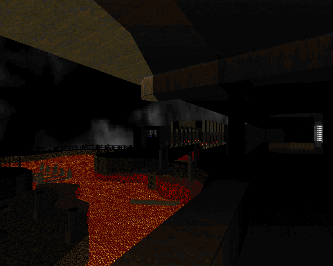
As an early example of its kind (and a community project to boot), Sacrament represents a mixed bag of generally realist or adventure-oriented mapping styles, but its stronger maps contain the seeds (and arguably the entire crop fields) for the particular style that would come to define Russian mapping. Maps like Wraith’s “Lavatraz,” Azamael’s “Seaport,” Dragon Hunter’s “Industrial Processing,” and Beewen’s “Controlled System” (maps 05, 11, 12, and 13, respectively) are sprawling, dim, and deeply moody, with an atmosphere so thick you couldn’t even stick a fork in it anymore, because it would just bounce off. They’re also rather empty on the whole, ignoring the conventional idea that large spaces must be filled with monsters and instead letting the enemies simply serve as inhabitants for a world that feels left behind.
The idea of being “left behind” – the incredibly strong sense of post-apocalyptic emptiness – is perhaps the most defining aspect of Russian realism
That idea of being “left behind”—the incredibly strong sense of post-apocalyptic emptiness—is perhaps the most defining aspect of Russian realism, and it’s exactly why the style is so realist. Cities, parks, building interiors, and other real-world settings are rendered with such intimate detail that you can’t help but wonder who lived in them before everything went wrong, and feel the deep sense of loss that’s left behind by their absence. Sacrament and many other Russian works also take advantage of PRBoom+’s ability to play .OGG music, which is used to back up the mood created by the maps themselves, so that the best of them feel absolutely drenched with emotive power.
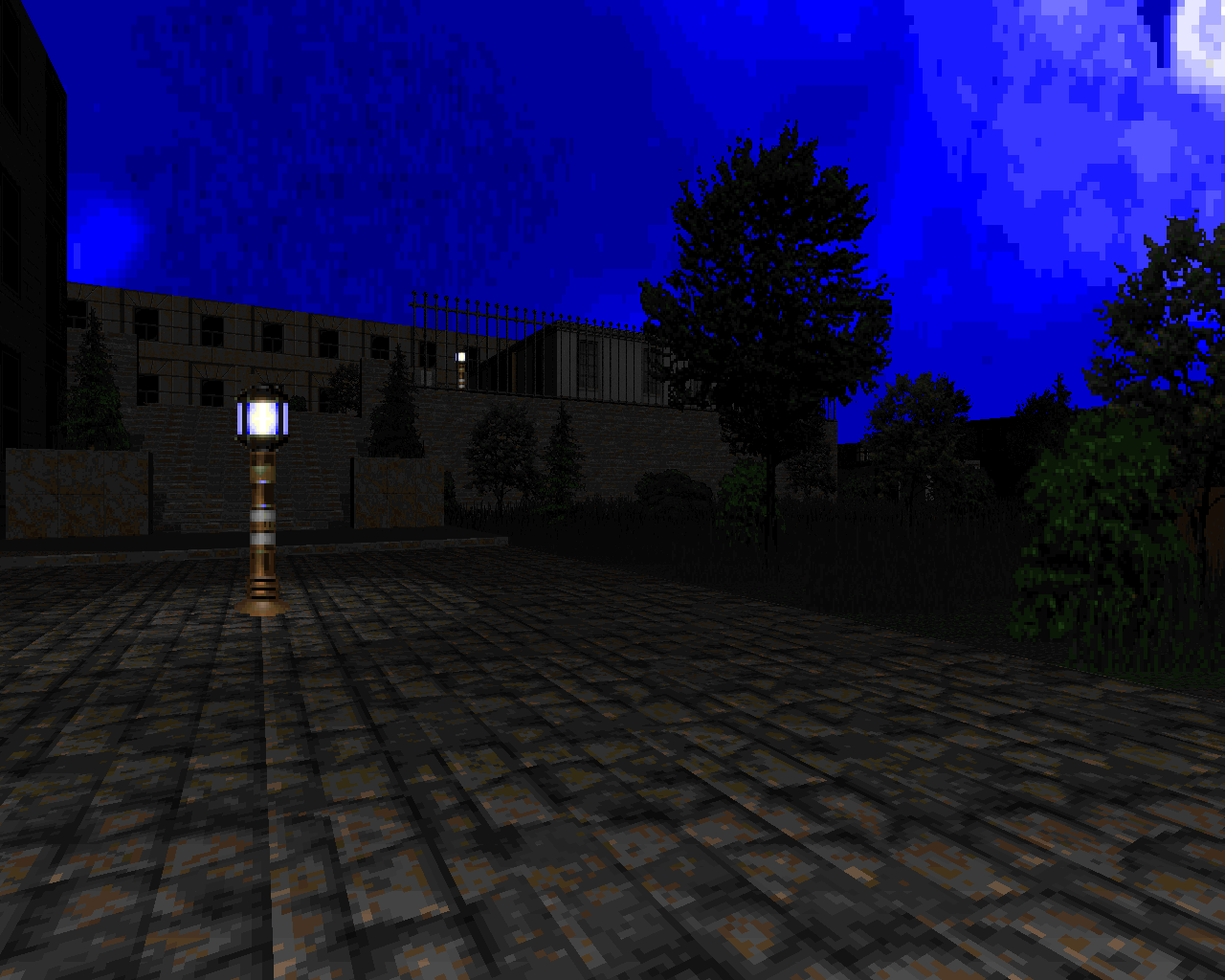
The whole style of mapping was best exemplified by Lainos, who served as a creative director for Sacrament (and other projects) and created its most famous map, “Doxylamine Moon” (map 02). Though his style shares many elements with the other mappers mentioned above, he seems most responsible for the ultra-realist direction of the project, and many of the specific usage tropes that other mappers would pick up in later releases. While other maps in the project emulate similar settings using stock or stock-like Doom textures, “Doxylamine Moon” is a stunningly realistic city layout that’s made all the more familiar through the extensive use of gritty, photorealistic textures. This aesthetic style became a major hallmark of Russian mapping in the years that followed and remained a staple of Lainos’s own maps, particularly his other two magnum opuses, 5till L1 Complex and Comatose. These two maps, along with “Doxylamine Moon,” place an enormous importance on nonlinearity and explorability, and a significant portion of each is completely optional; Lainos lets you complete them as quickly as you want and bow out if you get frustrated, but he knows that the complex, intriguing setting and the secrets it teases will keep you searching for as long as you’re able. And although the Doom community’s current fascination with sandbox maps probably can’t be traced back to a single source, I believe Lainos was a major factor in their rise to popularity, simply because he’s so good at creating places that players want to explore to the fullest.


