-

-
Chapter 11:
The Great Synthesis, Part 2
-
If you’ve been following the implications of this article at all, or if you’ve been hanging around the Doom community since the 2000s or early 2010s, you’ll know that there has historically been a huge rift. On the one hand, you have people with a classical ideology, who prefer either the original ‘90s experience of Doom or an enhanced, combat-driven version thereof; on the other hand, you have ZDoomers who prefer a more modern or feature-complex experience, using advanced features to transform Doom into something completely different. You could just as easily draw the divide between people who talk about “gameplay” (by which they usually mean combat intensity) vs. people who are more interested in aesthetics or concepts, regardless of the target port. But one thing that’s abundantly clear is that the wave of experimentalism in the 2000s, which was focused primarily on the Z-ports, led to a vehement reaction among the classicists, which gave birth to the more classical or combat-focused mapping schools that heavily dominated the period from about 2009 to 2016.
But as happens with all great divides in art, we’ve started to see mappers whose artistic sensibilities are rooted in both worlds, who want to create a fusion that represents the best of both. That isn’t to say that you can’t find much earlier examples of this synthesis if you look back through the history of ZDoom mapping; Winter’s Fury offers a very Doomy sort of combat intensity with a high level of polish, while fan-made Doom-engine games like Urban Brawl, Harmony, and Chex Quest 3 use port features to supplement a very retro style of gameplay. Even Simplicity, the creative grandparent of most ultra-modern ZDoom releases, was created as a partial return to old-school gameplay. But these releases were few and far between.
The wave of experimentalism in the Z-ports led to a reaction among the classicists, which gave birth to the more classical or combat-focused Doom mapping schools—but we’ve started to see mappers whose artistic sensibilities are rooted in both worlds
In the last few years, however, there’s been a tremendous explosion of releases that draw on more traditional or combat-driven ideologies while also taking inspiration from all of the advanced features and greater breadth of design choices that GZDoom offers. The concept at the heart of this movement is versatility—if a mapper’s vision requires some element that can’t be achieved within the limits of the classic formats, then why not move to a mapping format that can accommodate it? In other words, the new-school ZDoom mapper isn’t necessarily gathering features into a massive treasure hoard that’s built to impress; instead, they’re hand-picking the specific features that they need to accomplish a set of concrete design goals. If you need more custom monsters and weapons than you can add with Dehacked, then add them; if you want to create a visual aesthetic that’s fundamentally rooted in Boom mapping but augment it with slopes and 3D floors, then do it; if you want to build a map around a gameplay feature that doesn’t exist outside of UDMF, then use it. In the same way that Boom has been viewed as an expanded, more user-friendly alternative to vanilla format, GZDoom with a curated feature palette is becoming the new Boom, allowing mappers to expand even further.
-
 The Adventures of Square - BigBrik Games (2014)
Nobody Puts Mapping in a Corner
Adventures of Square is a retro indie game. It might seem like somebody decided to ask the age-old question, “What would another ‘90s Doom-engine game have looked like?” and then came up with the answer—but that’s not really what it is. Almost all great 2010s retro indie games (of which there are dozens if not hundreds at this point) are hybrids—they use (mostly) authentic aesthetics to create a sense of nostalgia, and they make every nod they can to the games of the past, but they’re also building on decades of hard-won knowledge about game design to iron out the kinks and create games too polished to have existed in the 1990s. In other words, they’re not afraid to throw in some modernisms if they have a good reason.
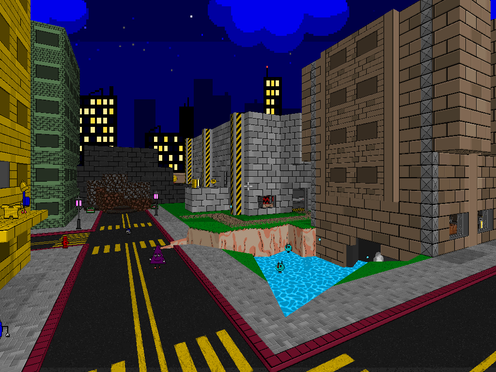
In creating their own Doom engine game, BigBrik had the opportunity to create a completely unique universe and aesthetic, and it’s no surprise they chose not to be limited by the specific set of features that’s available in the classic Doom engine. They needed something more flexible than that. Adventures of Square operates on a pan-‘90s nostalgia, taking elements from later Doom-engine games, Build-engine games, console platformers, action movies, and more. It creates a world in which 3D floors and slopes fit in seamlessly with simplistic, cartoony texturing and sprites, a world where much-maligned post-Doom features like particle fountains (here used to create cute bubbles rising up from fountain splashes) are coopted as just another natural part of the cartoon aesthetic. Perhaps the most modern element of the game is its hipster-tier ludicrous gibs, as it tosses far more paint splatters and smashed mechanical parts around every time you kill an enemy than the vanilla Doom engine could have handled—and yet it fits perfectly with our nostalgic memories of ‘90s gaming as a hurricane of stylized guts and explosions. BigBrik even revamped the game menu and added goofy story/info screens in the style of old PC platformers like Bio Menace to give the game an extra bit of charm.
It’s worth calling attention to the sound design as well, as it far exceeds anything that would be possible without GZDoom. A huge part of the game’s nostalgia is its cheesy wit, which is partly delivered through timely one-liners from the protagonist. Every enemy has multiple wakeup and attack quips, which adds a ton of character and keeps the game fresh and engaging even as you’re bombarded by sounds in the monster-dense levels. Ambient sounds abound, and caverns, tunnels, and basements all give an echoing quality to everything that you hear inside of them.
Adventures of Square represents a meeting of worlds, a bridge between fragments of the Doom community that had previously been isolated from each other
Adventures of Square also takes advantage of its target port by using tons of custom enemies and other actors, far more than would be possible even with MBF’s expanded set of replaceables for Boom-format maps. This is one of classic Doom’s most restrictive limits, as mappers can’t exceed the number of actors that are already in the game (resulting in often clever hacks in vanilla/Boom maps, like Valiant’s final boss, which replaces a blue torch). Adventures of Square has a large enemy roster, lots of item pickups, and tons of scenery (and it needed room to expand even further for later episodes)—but I doubt many would say that it’s excessive. Everything in the game feels like it has a purpose, even if that purpose is just to be cute. Friendly units in a variety of shapes run around in a panic in many levels, creating an interesting obstacle for empathetic players and adding silly drama. Multiple variants of cow bystanders appear in different environments as a running joke, and plenty of extra decorations exist just for easter egg gags. The game also throws in extra enemies for fun and variety, including special minibosses or enemies that only appear in secret levels. Stuff like this is actually an important part of the game, since Square’s aesthetic revolves so heavily around charm. It’s a game where the world feels extensive and oozes character, and all of the custom content is a major part of that.
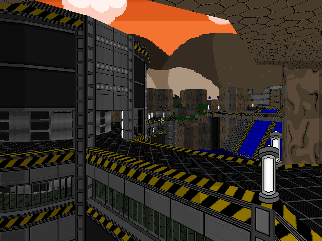
But at the same time, BigBrik kept a tight rein on their bestiary and approached their gameplay with a modern mindset. The enemies are designed to balance with the player’s weapons, and to present a challenge within the freeform, movement-oriented maps. The enemy set is designed as a legion, a diverse population that can threaten from multiple angles at once within large spaces without being frustrating for less skilled players. Its enemies aren’t always as differentiated into starkly different combat niches as Doom 2’s are, and it tends to steer away from very dangerous individual enemies (except for minibosses and bosses); instead, the combat is about responding quickly to variations, but each variation still has a purpose. Essentially, it offers a balance between the enemies-as-flavor approach of Tormentor’s mapping style and the enemies-as-pure-mechanics approach of modern Doom 2 challenge mapping—and in doing so, it’s able to appeal to a broad audience that includes both newer indie gamers and seasoned Doomers.
Every feature in Adventures of Square is implemented from a game design perspective, not simply for the sake of being cool
In other words, every feature in Adventures of Square is implemented from a game design perspective, not simply for the sake of being cool. Lethal forcefields and insta-kill liquids help shape the flow of the levels and gate the progression in intelligent ways; deep water becomes a normal part of navigation that integrates with other level design decisions, or a way to find cool secrets; rain and snow add to the atmosphere of maps but are tastefully limited and fit with the cartoon art style. A new, comically powerful type of explosive is first introduced as a way of ambushing enemies at the start of a level, in such a way that you can’t possibly miss the mechanical implications of it. Walls that can only be damaged by explosives—and explosives that the player can pick up and move around—are used to add mild puzzle progression or test the player’s memory and observational skills for accessing secrets. Bosses and other powerful enemies choose randomly from multiple attacks, which adds to the complexity of battles.
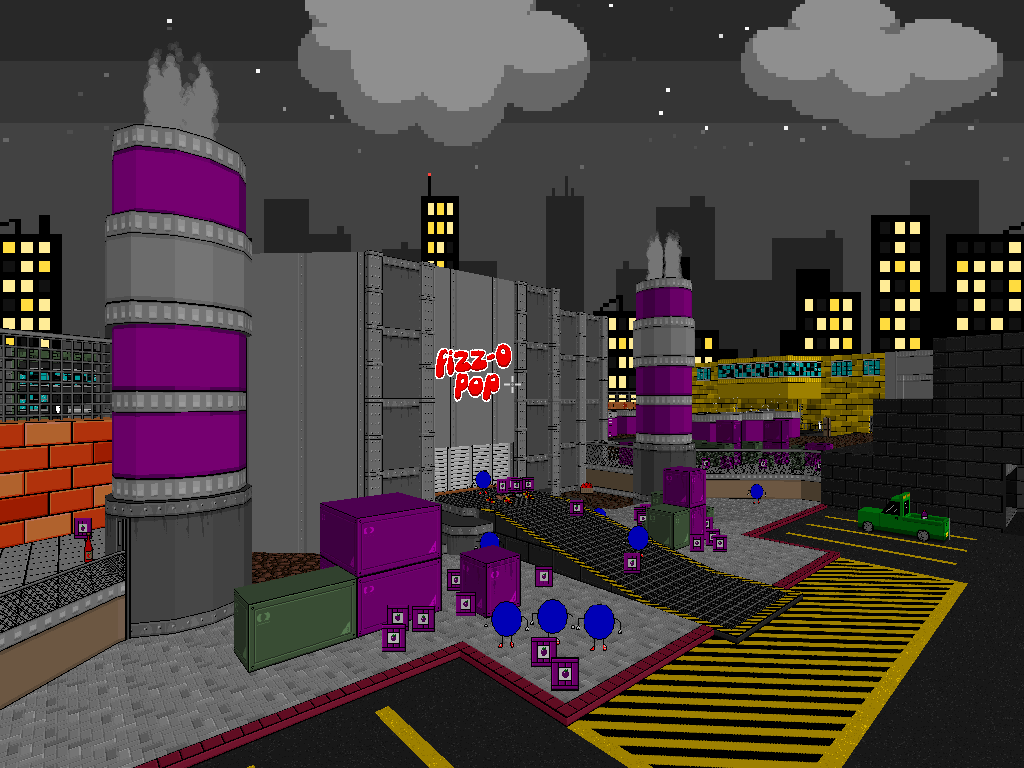
Episode 2, which was released in 2018, expands on the game’s core ideas in even more awesome ways, introducing major new mechanics as a key part of the level design—low-gravity jumping, airless outdoor areas that require special respawning gear to traverse safely, and even an elaborate lava chase sequence. The new Strongman enemy has the ability to pick you up and throw you around or hook you from afar and pull you in close, which allows it to play a major mechanical role in the maps; it’s often used as an added threat in areas with platforming sequences. But no matter how many cool features are added, they’ve always been thought through carefully and are always executed with a high level of polish.
Like Alien Vendetta, Adventures of Square represents a meeting of worlds, a bridge between fragments of the Doom community that had previously been isolated from each other. It offers a flawless blend of classic appeal, neo-classic combat, and modern features that are used in really neat ways—basically, there’s nothing it doesn’t do, and do well. And now, five years later, we’re starting to really see the ripple effects as many new mappers release projects with a similar energy.
-
 The Alfonzone - Pinchy (2017)
The Great Gonzo, Now in 3D!
Adventures of Square may be a completely different game, but The Alfonzone brings that ideology a bit closer to home. Pinchy’s megawad delivers the author’s signature classic-style combat, complete with ubiquitious hordes of popcorn enemies to blast to smithereens—but it’s also full of zany ZDoom mechanics that make the vast majority of its whopping 50 maps feel totally unique.
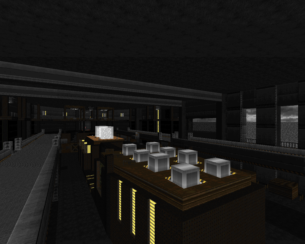
Ridiculously fast liquid currents rocket you around, architecture unfolds (and then re-folds, and unfolds again, and...) into a tour of every theme in the megawad, and a sentient sea of liquid pursues you upward through an entire episode. Adding to the bizarre and nonsensical sense of progression are the story texts before every map, courtesy of ZDoom’s Mapinfo. The map architecture is handled the same way as the gameplay—fundamentally rooted in Boomisms, but with incredible 3D elements like a towering crane and a battleship with floor-over-floor architecture that fit in perfectly and often add to the combat or progression. It’s totally classic Doom, but totally ZDoom at the same time, and like Square, it just goes to show how much both worlds have to offer.
-
 The Slaughter Spectrum - Bridgeburner56 (2019)
The Nouveau-Hardcore
GZDoom and slaughter combat were bound to collide eventually—and although The Slaughter Spectrum was created by a relatively inexperienced mapper and doesn’t exert nearly as much pressure on the most hardcore players as they have come to expect, it’s the first of it’s kind, so perhaps that’s beside the point. Bridgeburner’s mapset barely draws from Insane_Gazebo and Ribbiks at all; instead, it blazes its own trail and creates its own very distinct style. GZDoom features are everywhere, including tons of 3D architecture and floating objects that glow, bob, rotate, and revolve around. These 3D features work in conjunction with an aesthetic style that several new mappers, particularly Bridgeburner, have begun to champion—a style that revolves heavily around ultra-smooth curves, sharp points, and repeating stacks of border sectors and seems to take a lot of its sleek appeal from graphic/logo arts and tattoo art.
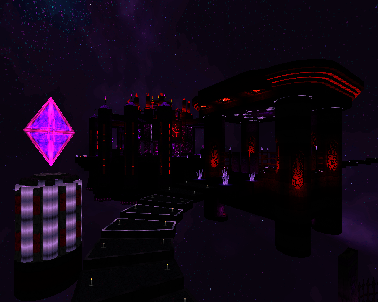
This whole style goes hand in hand with GZDoom’s version of the classic limitless void, which has served as the primary setting for slaughter maps since Ribbiks first appeared. Gameplay-wise, Bridgeburner seems to be reimagining slaughter gameplay from the ground up and gearing it toward the new audience of players who have arrived in the Doom scene following the release of Doom 2016, which is why it’s still a bit rough as yet. In any case, The Slaughter Spectrum was only released this past spring, but a quick look around will show you just how many people are already creating maps with a similar style.
-
 Dimension of the Boomed - Urthar (2018)
I Can’t Believe It’s Not ZDoom
DotB is a Boom-compatible mapset, but it feels so much like Quake that it’s hard to believe it doesn’t require a more advanced port. That’s because it pushes Boom features to the absolute limit, and has a lot of specialized tricks up its sleeve to boot.
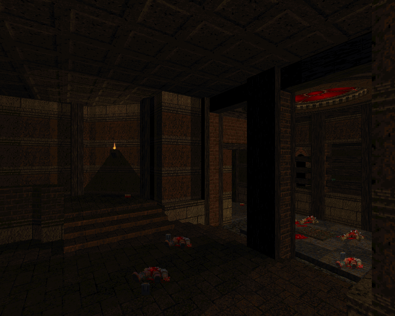
It makes extensive use of the features that are shared by both ports, such as scrolling skies and Boom’s version of deep water, as well as conveyor floors used to create wind tunnels and in-game OGG tracks that help replicate Quake’s creepy atmosphere. It also uses a ton of midtextures to create seemingly 3D objects or curved surfaces such as arches in believable ways, which is becoming quite common in Boom mapping.
Modern Boom releases continue to borrow tropes from GZDoom mappers—partly to show that it can be done without GZDoom
Perhaps the most mind-boggling element in the mapset is the appearance of slanted lighting against the walls, which shouldn’t be possible—and it turns out to be baked into the textures themselves, rather than actual cast light. Even as new GZDoom mapsets take lessons from neo-classic combat and level design, modern Boom releases like DotB, Maskim Xul, and Remnant continue to borrow aesthetic and stylistic tropes from GZDoom mappers—partly in an effort to show people that it can be done without GZDoom, but also, I suspect, partly because those tropes are too good for people not to want to use them.
-
 Eviternity - Dragonfly et al. (2018)
An Audience in Every Port
If you’re new to Doom and you’ve only heard of one megawad in your life, it’s likely Eviternity, which was released in the midst of a huge influx of modern gamers into the Doom community via the new Doom games and rode in on a year-long marketing campaign targeted at that expanded player base.
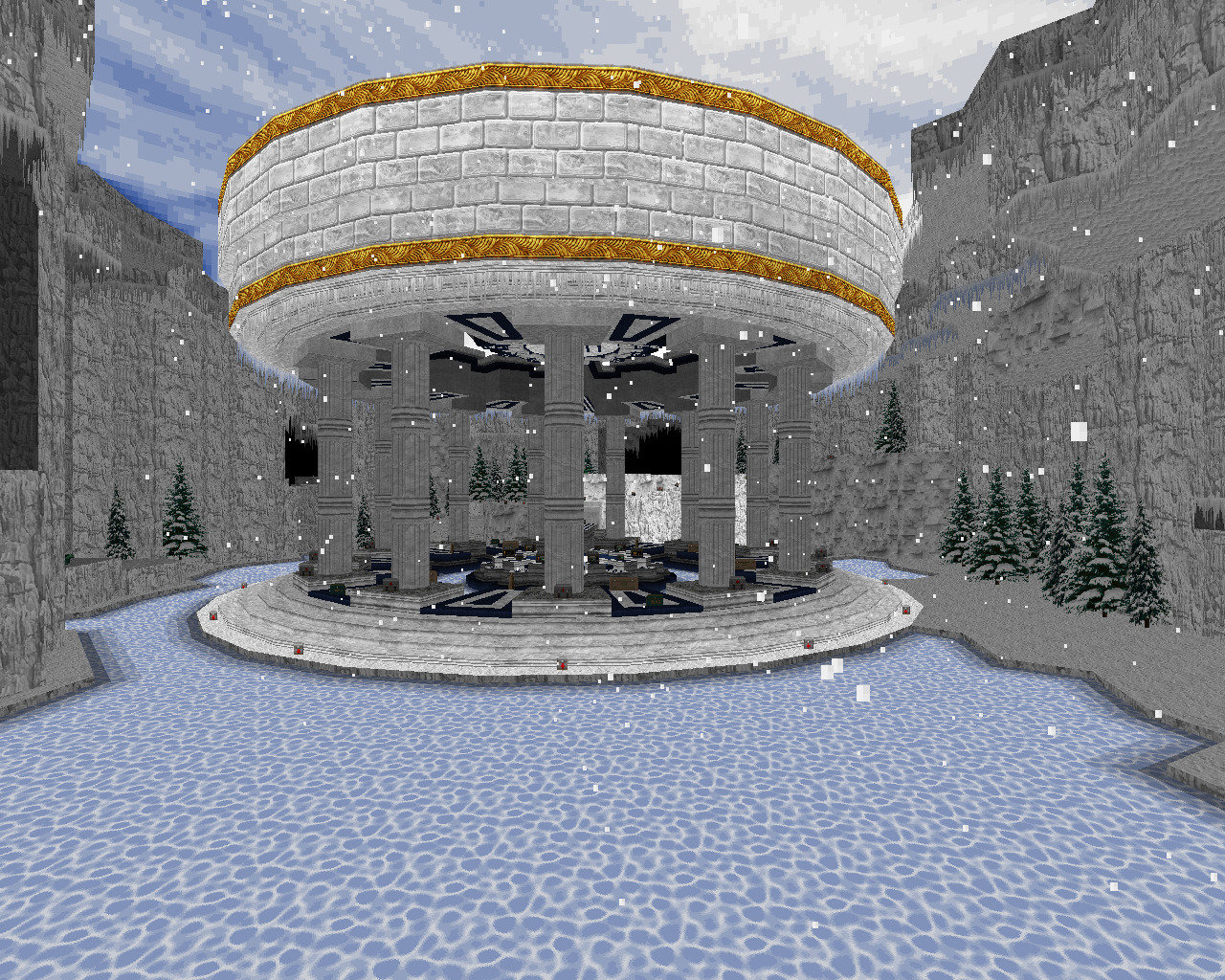
Eviternity is an MBF-compatible megawad that’s mainly styled after Scythe 2 and Valiant, but it also makes a very interesting set of accommodations for more modern players: optional GZDoom features. If you play it in GZDoom, you’ll see cool particle effects coming from the portals at the start of each episode, as well as weather systems such as snow in certain maps. If you play in a Boom-derived port, these effects simply won’t appear, but the maps will otherwise appear as normal.
It remains to be seen whether other mappers will implement optional GZDoom features, but my money says it’s too good an idea to pass up
In the old days, if you’d added GZDoom features, it would have made your mapset GZDoom-only; Eviternity’s features are made optional through the new ZScript language. The various special effects add a more modern vibe to the maps while remaining unobtrusive and allowing the megawad to retain a mostly classic feel—essentially, it allows the megawad to broaden its target audience. It remains to be seen whether other mappers will implement advanced features in this way, but my money says it’s too good an idea to pass up.
