Jump to content
Search In
  • More options...
Find results that contain...
Find results in...
  • NOTE: There is a known issue with the most recent entries having screwed-up information and links. Some databases are out of sync and we haven't been able to fix it yet.

WIREFRAME DOOM

   (11 reviews)
Sign in to follow this  

Guest

4 Screenshots

About This File

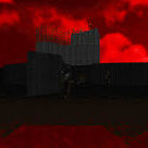
After thinking of how cool wireframes are, I thought to myself: "Gee, I wonder how would Doom look if the textures were made to look like they're wireframes!" This is the result.

As you've probably noticed, there are 3 colors of wireframe. Green are the normal walls. Red are used on textures often used for interactable things (namely: switches, doors, elevators). Lastly, blue ones are used on "liquid" textures, as they often are set to damage the player, so don't be surprised when a floor melts you. =P


User Feedback

Create an account or sign in to leave a review

You need to be a member in order to leave a review

Create an account

Sign up for a new account in our community. It's easy!

Register a new account

Sign in

Already have an account? Sign in here.

Sign In Now

Nine Inch Heels


Have to agree with a previous review: Both the flats and the textures don't align with a size 64 grid in a map editor. Unless you can align flats as is possible in for example in UDMF, this isn't a resource you'll have a good time creating maps with, and even if you're working in a format that can align flats, you're better off using a higher quality resource to begin with anyway.


Flats and textures are "off grid" because they're not a black square with a green frame around it, which is how it ideally should have been. A quick look around in SLADE shows that the coloured lines are 3px wide, so something had to give as a consequence. A perfectly centered black square inside a 2-3px wide frame would have done the trick just fine.

A neat idea that was put to use for example in valiant map 32, except valiant used a better resource that is more forthcoming towards mappers. If you want a resource for wireframe stuff, you're better off looking elsewhere, or cooking your own wireframe textures from a greyscale-base, and colouring them however you want to.


With all that said, this isn't entirely bad: It's fun to load up doom2 and giggle at how "weird" everything looks all of a sudden, but it's a short lived laughter due to a very limited colour selection, so the novelty aspect wears off fast, unfortunately.

Share this review


Link to review
Misty


This is the great idea, but wireframes are 2px off(or even more) and they automatically don't align well from the start. Of course, if you use more advanced mapping format, this shouldn't be a problem, because you can align flats and walls accordingly and match them, but on more conservative formats this can be irritating. 


Spoiler

Screenshot_Doom_20190512_154006.png

MAP01_at_2019.05.12_15-25-57.592_R3058.j


Share this review


Link to review
Guest

Unknown date

  
5/5 I love this type of stuff. one time i did something similar with the blue tech and wolfenstein stone wall but it got kinda boring. but this wireframe idea worked out surprisingly well. wow. 5/5

Share this review


Link to review
JPL

Unknown date

  
Cool! Different color for the skies would be nice.

Share this review


Link to review
Guest

Unknown date

  
It's an interesting idea, but needs to be developed further. Quite simply, it's boring to have exact same texture/color everywhere on every map. And skys could benefit from special treatment. I think an earlier mod did something similar but took it farther. Was called 8-bit deathmatch or something?

Share this review


Link to review
xnv

Unknown date

  
Whoa, this looks surprisingly good. I bet you can base a whole mapset on textures like this.

Share this review


Link to review
Guest

Unknown date

  
Hmm... I've seen most of this about 20 years ago, so it's not original at all. I do remind having played a level (don't know the name anymore, it's too long ago) build around this concept; after having played it for 10 minutes, you've just seen it, and won't play it again. Mostly because it is too monotonous. Besides that, avoiding very ugly texture misalignments dramatically limits a level builder to using a very large grid, so details are gone. 2/5 for raising the idea.

Share this review


Link to review
cs99cjb

Unknown date

  
Good concept, well executed

Share this review


Link to review
Walter confetti

Unknown date

  
that's a pretty interesting concept, very retro-stylish! Playing this with some chiptune and 8-bit sounds will be awesome!

Share this review


Link to review
  • File Reviews

    • By PsychEyeball · Posted
      Cyberdreams is the perfect WAD for people who don't feel like shooting demons in Doom and yet want to feel extreme danger and tension. Instead, you must challenge Cyberdemons in a game of wits and swift movement to get them telefragged, crushed or stuck inside obstacles. Failure to do so will result in a rocket in your face... and likely death. Forget about fighting them back with weapons; all you have is your fist and sometimes, a pistol, which you'll use to shoot switches from a distance.   The gameplay of Cyberdreams is simple, yet so unique for a vanilla megaWAD from the late 90s. You'll usually run around, pressing or shooting switches while dodging cyberdemons or herding them at places where they won't be as much a threat. I wouldn't be calling this a puzzle WAD since it's usually obvious as to what needs to be done in any given level, but it's definitely a conceptual map set which plays by its own rules.   Not every level concept comes out well (*cough* Hot Dog *cough*) and some levels tend to recycle the same gimmicks, which docks it a few points. It also doesn't have any MIDI replacements at all (with that said, a MIDI pack was made for it so there's an alternative!). But in overall, Cyberdreams is a very good reimagining of Doom as a game which is worth checking out.
    • By AdministrationCenter21 · Posted
      I mean it's alright like. 
    • By MeriMemesX · Posted
      Do you want to cry because you don't know when the suffering will end? Did you think BTSX maps were short? You love mazes? More important... Do you love lost souls?   Well, this map is for you!   With an average duration of 1 hour, this map has made me suffer 4 mental breakdowns (and while I remember everything, a 5th) Not because of the difficulty (which is high) If not because I had already started to get dizzy from being so many hours exposed to the screen and (especially) dying from Lost souls   And you'll tell me, "But you did it!" Well... My body is still there, I'm speaking to you from beyond the grave!   I'm not kidding when I say that the map has given me headaches, dizziness, (and the occasional fainting spell) NOT JUST BECAUSE I SUCK AT THIS GAME! BUT BECAUSE THE WAD IS CONFUSING IN SEVERAL PLACES   Other than those times when my soul left my body and wandered around for days (specifically with 4 day breaks between sessions) yeah, it's ok.
    • By PurplDanial · Posted
      The best doom wad to live CHAPTER 1 - WHY?
      This wad showcases an story, not just "get gun, kill demons", An cyberdemon has escaped from "The lab" Bringing in an precise feeling of mystery and vagueness to The organization That hosts "The lab" CHAPTER 2 - GAMEPLAY The gameplay is never seen before, NO GAMES in 1999 Ever had such stunning gameplay, with the cyberdemon and bfg being used in an "Illusio pit" As an environment, Truly showcases the creative depths the devs went in to make this wad
×