
If there's going to be one thing I can say about this map, it would be that it's... interesting. If you're reading this review in the hopes of looking for a hardcore deathmatch map to play in, you might want to skip ahead. Ambush Arena is true to its description when it says it introduces a "neat twist" to the map. So what's the gimmick? Your guy wears as its skin a marine in a perpetual death frame. What this translates to is some pretty funky gameplay, as well as an aggravating play experience.File name: ambusha.wad Author: Brad Spencer Map Size: Medium Map Summary: "A deathmatch arena level similar to Dwango5...but it has a *neat* twist to it. Move too much and your position is revealed!" (Excerpted from ambusha.txt)
In the beginning it's easy to get caught up in the spirit of the game. Since everyone looks like the dead marine guy, it's normally in your advantage to stay still and wait for others to make their move. It then turns into a game of cat and mouse as players try to stay still while building an arsenal at the same time. Anyone caught moving will stick out like a sore thumb, which usually results in having the poor schmuck eating a barrage of rockets. But how does this affect gameplay in the long run?
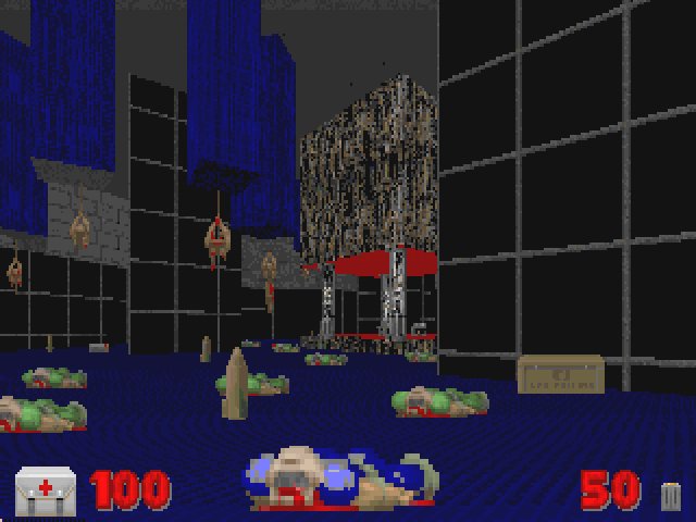 Yep, this is what your guy looks like. Ugh.
What happens is that after about 5 or so minutes of this, the novelty begins to wear thin. I'm not sure about the rest of you, but if I don't frag somebody within 2 minutes or so I begin to get a little restless. Even if you do decide to stick with the game and play it out, the concept begins to fall apart despite good intentions. For example, because Zdoom allows everyone to choose their own custom color for use within the game, everyone can just set their skin color to the standard neon green and blend in perfectly with all the other dead bodies in the arena. Not only that, because the map is so dark, it makes finding other players even more of a chore than it really has to be. Another big problem is that despite the fact the skin you're wearing stays close to the floor, your viewpoint sticks to its original position. Because of this, it makes for one-sided situations where only one player can see the other, even if both would be in plain sight under normal conditions. The results are usually messy, with one player getting a cheap kill without the victim getting a chance to avoid the attack.
 Nothing in life comes easy - blur spheres and plasma guns included.
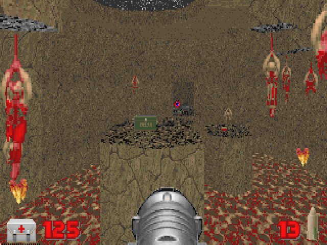
Bad gimmicks aside, the map design isn't all too bad to begin with. It's made up of a big arena on one side, with two other smaller areas on the north part of the map. The architecture is pretty plain, but it does the job. Pillars and platforms in the arena area help to break up lines of sight, and gives players some leeway when in the middle of a tough duel. There's a plasma gun sitting right smack in the middle, but taking it will give players who do so a big deduction in health. The other areas though aren't so great though; for some unfathomable reason, the author decided to put one of those dreaded walk-thru walls in the level. Why? I'm not sure, but I'm guessing that it was placed in there to add even more to the hide and seek aspect of the map. Unnecessary in my opinion, but some people might actually get into it. There's also an area where people can take advantage of the player death skin; one window in the map has a lower edge high enough to obscure your skin, giving you free reign to send rockets through to the next room nearly undetected. See the screenshot below for an example of this.
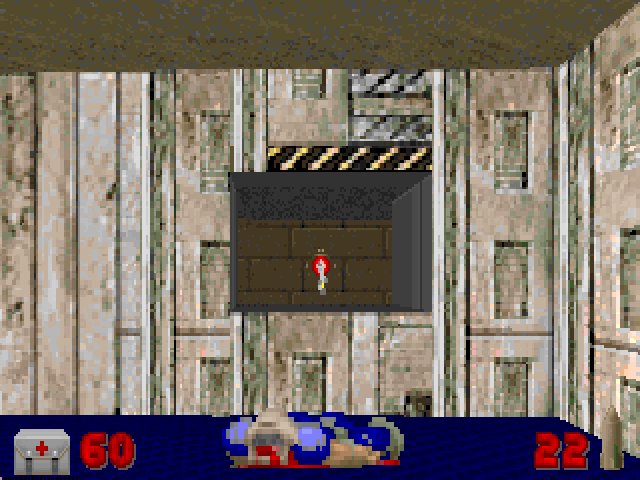 There's not much chance to avoid attacks like these.
If this wasn't aggravating enough, the map suffers from severe sprite decoration overload. It's an unfortunate requirement to have all the dead marine bodies for the ambush concept to work, since they make the map look really amateurish (hey, didn't we all put tons of dead bodies when we made our first map?) The texture choice is also lacking in creativity, and mostly consists of some harsh contrasts and room transitions. A perfect example of this is the rocky lava room that holds some goodies. The room looks really good overall, that is until you notice the blue computer floors and metal lift on the opposite end. Sigh.
Ambush Arena is a well-meaning map, but the hide and seek concept just doesn't work. It might be fun to try for a while, especially for anyone looking to add a little variety to their deatmatches. You might even have some fun for a while, but only as long as the novelty lasts.
Review by Razorback
The Doom DM Resource Recommends:Get Ambush Arena from Brad Spencer's homepage.4 players Any skill setting Play over Doomserv Any skin color *except* default green